Reprinted from the March 2014 issue of
The Bluesletter from Washington Blues Society.
I am posting this because of a few reasons: The Randy Oxford Band helped me get both my graphics and my writing kick-started after a (too long) hiatus, Liz Caraway interviewed me in the article (as well as other key players in the production of the CD cover), and also because Dan Hill's photo was somehow not included in the article and it should have its rightful place.
Creating a CD Cover That “Feels Good”
By Liz Caraway
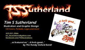
Edited by Tim Sutherland
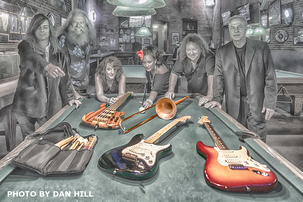
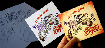
Last October I saw a picture of The Randy Oxford Band by Dan Hill which took my breath away! The first thing I thought was that it would make an amazing CD cover! I then saw a graphic, done by Tim Sutherland, which was said to be the cover for the band’s new release. Tim’s design wasn’t anything like Dan’s photography, so I figured that Dan’s pic would be used for another project... Little did I know, magic was about to happen! I saw the final product, and… They did it! They seamlessly brought together the two styles and “…it feels good…”! I decided to ask Randy how he was able to make these seemingly opposite images come together so beautifully.
Liz Caraway: How did you come up with the title, “…it feels good…”?
Randy Oxford: “…it feels good…” was a slogan that I came up with when I first started my band in 2003. Being a band leader and getting to hire top notch musicians who are willing and able to travel while remaining pleasant to work with no matter what the gig is, feels good to me so I came up with the slogan and I finally decided to use it as a CD title.
LC: How did the CD cover come about?
RO: I posted on Facebook, asking for artist submissions for a CD cover with the title “...it feels good…” and Tim seemed to get what I was asking for, and we went with his submission. My project managers, Faith Loomis and Michele Sabol, were also involved in choosing the final art.
LC: What about the creation process did you enjoy?
RO: Asking Faith and Michele to take charge of the look and feel of the CD layout was a good call; all I had to do was focus on being a music producer in the studio. The team of people you see listed in the credits made this project what it is; we are all very proud of the final product… it feels good!
Randy’s known for finding the right people and then letting them do what they do best.
I asked Michelle Sabol about her influence on the cover’s creation, and she humbly gave credit to everyone else…
LC: Michele, please tell me your involvement in the cover project.
Michele Sabol: I guess the first part for me was at -tending the studio sessions and then onto the engineering and mixing. What a process! I loved every minute of the experience. Tim gave us the cover and we worked the graphics from there. I had an idea of the layout, while Faith put it all together. It took some editing, but then we agreed “…it feels good…”.
Faith Loomis is Michele’s daughter and I asked her to share her experience with us.
LC: Faith, how was your experience working on the CD cover?
Faith Loomis: This project was a blast! I’m so grateful to be a part of it and such a wonderful group of people.
LC: Was it hard to combine the two very different styles together?
FL: Actually, it’s funny you ask, because at first it was. I asked for Tim’s design to bleed over onto the back, as well as for the ember effect throughout. I think it all came together beautifully.
LC: How was working with everyone?
FL: Well, my mom is like me: we both have an artistic vision for things but neither of us can hand draw! I ad-mire the way some people can take their artistic vision and put it on paper the way Tim did. Then there’s Dan’s very artistic eye and talent for taking a photo and creating something really cool. Finally, Disc Makers put our vision all together. Overall, it was a GREAT experience!
I told Dan Hill that I was surprised and really pleased with how the cover came out. I was worried that his photos would lose attention, but they combined the work very well.
LC: When Randy approached you about taking pictures, were they originally for the CD or just for promotion?
Dan Hill: I believe we were talking about using the photos for both CD and promotion.
LC: What kind of editing did you use with the photos on the CD?
DH: I use Adobe Lightroom and Photoshop CC for the ‘heavy lifting’ along with plug-ins from Alien Skin (Snap Art and Eye Candy) and the Nikon filters. The ‘digital manipulation’ is all me.
LC: Whose idea was it to gather around the pool table with the instruments?
DH: I suggested that we gather around the pool table, and I think that it was someone in the band who suggested putting the instruments on the table.
LC: How many pictures did you take?
DH: Probably between 1 and 200.
By Liz Caraway
Edited by Tim Sutherland
Last October I saw a picture of The Randy Oxford Band by Dan Hill which took my breath away! The first thing I thought was that it would make an amazing CD cover! I then saw a graphic, done by Tim Sutherland, which was said to be the cover for the band’s new release. Tim’s design wasn’t anything like Dan’s photography, so I figured that Dan’s pic would be used for another project... Little did I know, magic was about to happen! I saw the final product, and… They did it! They seamlessly brought together the two styles and “…it feels good…”! I decided to ask Randy how he was able to make these seemingly opposite images come together so beautifully.
Liz Caraway: How did you come up with the title, “…it feels good…”?
Randy Oxford: “…it feels good…” was a slogan that I came up with when I first started my band in 2003. Being a band leader and getting to hire top notch musicians who are willing and able to travel while remaining pleasant to work with no matter what the gig is, feels good to me so I came up with the slogan and I finally decided to use it as a CD title.
LC: How did the CD cover come about?
RO: I posted on Facebook, asking for artist submissions for a CD cover with the title “...it feels good…” and Tim seemed to get what I was asking for, and we went with his submission. My project managers, Faith Loomis and Michele Sabol, were also involved in choosing the final art.
LC: What about the creation process did you enjoy?
RO: Asking Faith and Michele to take charge of the look and feel of the CD layout was a good call; all I had to do was focus on being a music producer in the studio. The team of people you see listed in the credits made this project what it is; we are all very proud of the final product… it feels good!
Randy’s known for finding the right people and then letting them do what they do best.
I asked Michelle Sabol about her influence on the cover’s creation, and she humbly gave credit to everyone else…
LC: Michele, please tell me your involvement in the cover project.
Michele Sabol: I guess the first part for me was at -tending the studio sessions and then onto the engineering and mixing. What a process! I loved every minute of the experience. Tim gave us the cover and we worked the graphics from there. I had an idea of the layout, while Faith put it all together. It took some editing, but then we agreed “…it feels good…”.
Faith Loomis is Michele’s daughter and I asked her to share her experience with us.
LC: Faith, how was your experience working on the CD cover?
Faith Loomis: This project was a blast! I’m so grateful to be a part of it and such a wonderful group of people.
LC: Was it hard to combine the two very different styles together?
FL: Actually, it’s funny you ask, because at first it was. I asked for Tim’s design to bleed over onto the back, as well as for the ember effect throughout. I think it all came together beautifully.
LC: How was working with everyone?
FL: Well, my mom is like me: we both have an artistic vision for things but neither of us can hand draw! I ad-mire the way some people can take their artistic vision and put it on paper the way Tim did. Then there’s Dan’s very artistic eye and talent for taking a photo and creating something really cool. Finally, Disc Makers put our vision all together. Overall, it was a GREAT experience!
I told Dan Hill that I was surprised and really pleased with how the cover came out. I was worried that his photos would lose attention, but they combined the work very well.
LC: When Randy approached you about taking pictures, were they originally for the CD or just for promotion?
Dan Hill: I believe we were talking about using the photos for both CD and promotion.
LC: What kind of editing did you use with the photos on the CD?
DH: I use Adobe Lightroom and Photoshop CC for the ‘heavy lifting’ along with plug-ins from Alien Skin (Snap Art and Eye Candy) and the Nikon filters. The ‘digital manipulation’ is all me.
LC: Whose idea was it to gather around the pool table with the instruments?
DH: I suggested that we gather around the pool table, and I think that it was someone in the band who suggested putting the instruments on the table.
LC: How many pictures did you take?
DH: Probably between 1 and 200.
I wondered how Tim Sutherland approached this project and its vague theme, “…it feels good…”, and ran with it.
LC: You’ve done a sweet bit of graphics for this CD cover Tim, how did you get involved in this project?
Tim Sutherland: Thank you! I contacted Randy about the cover because of his contest, and we talked about how everything should convey the “...it feels good...” attitude. My design represents each band member, and the band’s loose, free flowing music style.
LC: How did you come up with the fire?
TS: The flame logo was almost by accident, a result of tweaking the logo until it took on an attitude all its own -- which fits the band well because they are on fire! I then flamed up the title font so it would work with the band logo.
LC: Does it …feel good… to be a part of this project?
TS: The whole aura about The Randy Oxford Band is that “...it feels good...” and being a part of this project sure does!
Well, it’s obvious to me that Randy Oxford knows how to find great talent to create a great CD cover that FEELS GOOD!! ~ Liz Caraway
 RSS Feed
